
14 November 2025

This article was first published on LinkedIn as part of the Signals over Noise newsletter.
When McKinsey & Company publishes research on the Chinese automotive consumer, people in the industry pay attention. The report aims to shed light on massive shifts in the world's largest auto market—shifts that may predict trends we'll see across the globe. If you rely on customer surveys in your work, whether creating them or using their results to make decisions, this article is for you.
Before we dive in, a brief word on my perspective. McKinsey was my first job out of university; I spent four years there and even worked in the same team as one of this report's authors. With over a decade of experience in market research and consulting, I have since founded my own market intelligence company, precisely because I believe the methods we often rely on are no longer fit for purpose.
It’s easy to dismiss survey results that feel improbable or don't align with our own beliefs. My goal here, however, isn't to simply dismiss, but to connect every critique to a specific methodological challenge. Let's start by looking under the hood of how research like this is made. (If this sounds too dry, trust your instincts and scroll down to where we get into the charts).
The Realities of Consulting Surveys
First, it’s important to clarify what "a McKinsey survey" really means. It's a common practice in consulting for the firm to design the questionnaire but then outsource the fieldwork to a specialized vendor. There is nothing inherently wrong with this, but it creates a one-way street of communication. Unlike a direct interview, there are no opportunities to ask clarifying questions, probe deeper into an interesting answer, or ensure a respondent has understood the question as intended. The analysis is done on whatever was put into the replies, and nothing else.
Second, this report features 35 exhibits, suggesting a lengthy questionnaire. Assuming most respondents took the same, single online survey—as opposed to the sample being split into smaller groups that each answered a different set of questions—this brings us to a critical issue in market research: survey fatigue.
In an age of notoriously short attention spans, a long survey is a risky proposition. When faced with too many questions, respondents can get bored or tired, leading them to answer more randomly or abandon the survey altogether. The report states a sample size of 2,498, but we don't know what the completion rate was. This ambiguity raises several critical questions about data quality:
- How do you treat partial data? What about the early answers from respondents who dropped out? Were they rushed as they tried to get through the survey?
- What about the "finishers"? How many of the people who did complete the survey simply rushed through to the end, compromising the quality of their later answers?
- Is the final sample truly representative? If the dropout rate was high, the remaining sample may over-index on a small group of highly engaged (or exceptionally patient) individuals, skewing the results.
Another issue lies in the report's timeline. The survey ran from Q4 2024 to Q1 2025, with the report published in September 2025—a lag of six months or more after the final data was collected. In a fast-moving automotive market, where new models launch monthly and consumer preferences shift rapidly, a six-month delay means the insights risk describing yesterday's market rather than informing today's decisions.
The 3-Step Evaluation Framework
So, how can we fairly and systematically evaluate this report's findings? To move beyond gut feelings, I will apply a simple, three-step framework to key charts and their takeaways.
For a finding to be a "Hit," it must pass all three tests. If it fails on even one, I'll call it a "Miss":
- Do the question and answers make sense? (Is the wording clear? Is the selection methodology sound? Are the answers mutually exclusive and collectively exhaustive?)
- Is the conclusion based correctly on the data? (Does the key takeaway accurately reflect what the numbers show?)
- Does the finding advance our understanding? (Does it offer a genuinely useful or new insight into the Chinese auto market?)
To see this framework in action, let's apply it to a selection of the report's most revealing charts.
Critiquing the McKinsey Research
Let's dive in into the visuals selected.
Visual 1: Branding is less important to EV buyers; Verdict: ❌ Miss
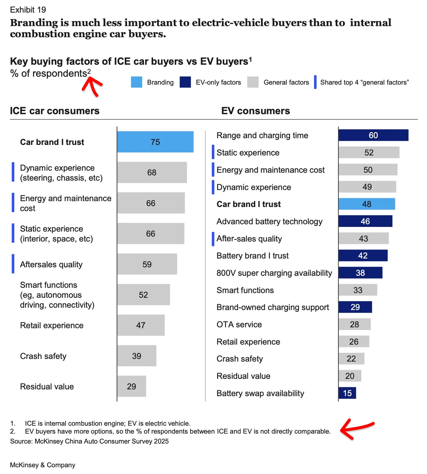
At first glance, this chart appears compelling. The topic is important, the conclusion is insightful, and I was a little pleased to see that "sustainability" didn't even make the list—a refreshing departure from the obligatory environmental messaging that other consultancies often force into auto research (as I discussed in "Customer Surveys: Half-True or Totally Wrong?").
But there's a fundamental problem that makes this entire comparison unreliable: the report doesn't specify how many factors respondents could select. Judging from the figures, it appears respondents may have been asked to choose their top 5 factors in both cases, but the EV buyers had significantly more options to choose from.
This matters because having more options dilutes the percentages across all categories. Yes, "Car brand I trust" shows a 27 percentage point gap (75% for ICE vs. 48% for EV). But look at the other factors: Static experience drops 14pp, Dynamic experience drops 19pp, Energy and maintenance cost drops 16pp, Smart functions drop 19pp, Crash safety drops 17pp. Everything is lower for EV buyers.
If brand trust genuinely mattered less to this group, why would almost every single factor show similar declines? The explanation is that EV buyers had more options to choose from (notice all the EV-specific factors like "Range and charging time," "Advanced battery technology," and "Battery swap availability"), which mechanically reduced the percentage selecting any individual factor, including brand trust.
McKinsey mentions this as a footnote:
"EV buyers have more options, so the % of respondents between ICE and EV is not directly comparable."
If the data isn't directly comparable, why present the two columns side by side and draw a definitive conclusion from the comparison?
In the report, below the chart it says:
"Some general factors such as static or dynamic experience, vehicle ownership costs, and after-sales service receive nearly identical importance rankings from ICE and EV owners, after excluding brand-specific and EV-unique factors."
If a 19pp difference in dynamic experience counts as "nearly identical," what does that make the 27pp brand trust gap?
Verdict: ❌ Miss. The question design makes answers incomparable, something the authors acknowledge in their own footnote yet ignore in their headline. Because of that, the conclusion is not reliable.
Visual 2 (well... technically, it's two exhibits combined): Technology Has 3x the Impact of Price on Purchase Timing; Verdict: 🎯 Hit
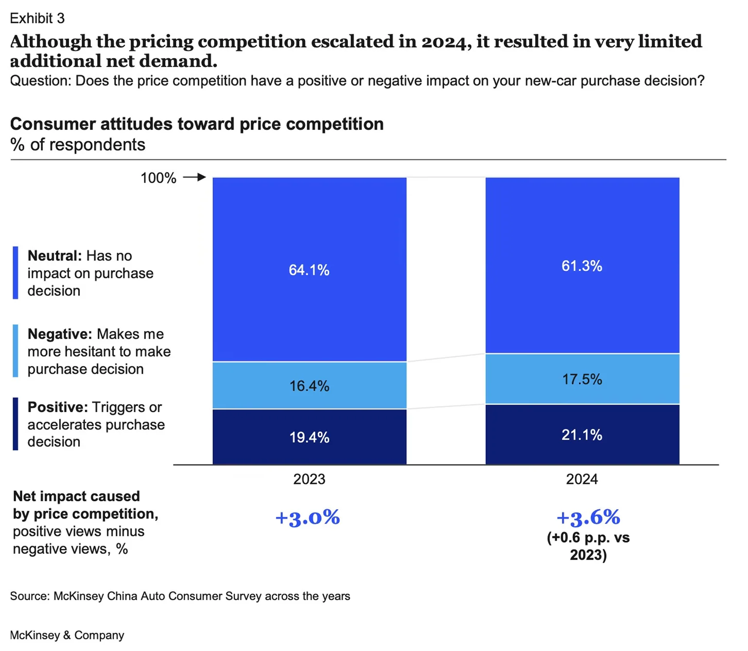
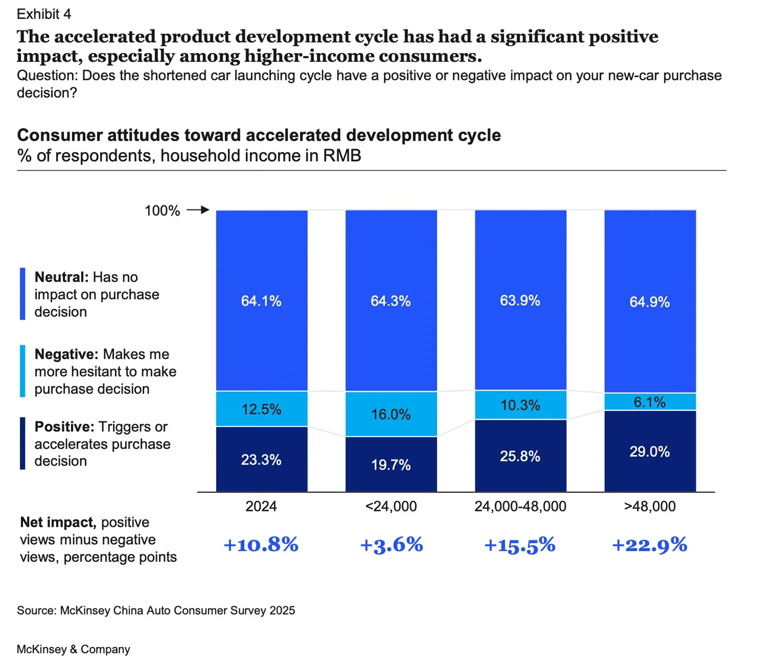
Let's try to be clear about what's being measured. These charts don't assess whether price cuts or technology advancements increase sales volume per se—rather, they measure whether pricing or technology changes affect the timing of purchase decisions among the respondents. Specifically, do these factors make consumers more likely to accelerate their purchase, delay it, or leave their timing unchanged?
For price competition (Exhibit 3), the 2024 data shows 21.1% of respondents say it triggers or accelerates their decision, while 17.5% say it makes them more hesitant. The net effect is +3.6 percentage points—a modest but positive impact.
For accelerated product development cycles (Exhibit 4), the pattern is more pronounced. Looking at the 2024 overall figure, 23.3% say it triggers their purchase while only 12.5% say it creates hesitation, for a net positive of +10.8 percentage points. More strikingly, the effect increases dramatically with income level, reaching +22.9 percentage points among the highest earners.
Comparing the two exhibits together reveals that technology advancement has roughly three times the net impact on purchase timing as price competition does. This is a useful finding for automakers deciding how to allocate resources between aggressive pricing and rapid product innovation.
However, McKinsey's interpretation goes too far in my opinion. The report concludes that the price war's 0.6 percentage point improvement year-over-year is "clearly not worth the expense" given the cost of discounts for OEMs. This framing assumes an industry-wide perspective, but individual automakers don't have that luxury. In a competitive market, if your rivals are cutting prices and you don't, you risk losing significant market share—even if the industry as a whole gains little net demand. McKinsey's conclusion conflates what's rational for the industry collectively with what's rational for a single player.
Verdict: 🎯 Hit. Despite conflating in the report industry-level dynamics with individual firm strategy I think the analysis is solid enough and the conclusion insightful.
Visual 3: Premium German brands buyers increasingly cross-shop Chinese EVs; Verdict: 🎯 Hit

This chart examines cross-shopping behavior between premium German brands and premium Chinese EV brands, showing how buyers' consideration sets have evolved from 2023 to 2024.
The light blue highlighting draws our attention to the chart's headline finding: 40% of premium German brand buyers in 2024 included premium Chinese EV brands in their consideration set, up dramatically from just 7% in 2023. This 33 percentage point jump suggests German brand shoppers are increasingly open to Chinese alternatives.
But there's a second story here, highlighted in dark blue: 21% of premium Chinese EV buyers also considered premium German brands in 2024, up from 12% in 2023. While this 9 percentage point increase is more modest, it reveals something important—the cross-shopping is bidirectional.
During my time at McKinsey, we were taught to highlight data that directly supports the slide's key message. Here, the light blue highlighting does exactly that. However, the dark blue highlighting tells a little different story—one that doesn't directly support the headline but may actually be equally interesting.
Taken together, these two trends suggest that buyers of premium German brands and premium Chinese EV brands are increasingly becoming the same group of customers. Rather than two separate customer bases, we're seeing a single premium segment that considers both Chinese and German brands as legitimate alternatives to each other. This convergence represents a fundamental shift in competitive dynamics.
What drives this convergence? Is it Chinese brands building credibility over time, narrowing the perception gap? Or is it German brands' struggles in the EV space making Chinese alternatives more attractive by comparison? The data doesn't tell us, but the question matters for strategic planning.
If McKinsey wanted to emphasize this convergence story, the current dual highlighting would work (although having a single blue rather than two different shades may be better). But as it stands, the dark blue highlighting feels somewhat disconnected from the headline message.
Verdict: 🎯 Hit. The only weakness is a slight mismatch between headline and highlighting choices. The analysis is solid and the conclusion can be drawn from the data presented.
Visual 4: Brand heritage is the most important factor in defining a premium car brand; Verdict: ❌ Miss
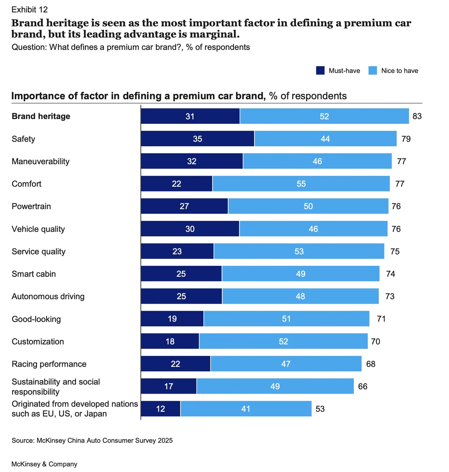
The key message states that "brand heritage is seen as the most important factor in defining a premium car brand, but its leading advantage is marginal." This conclusion only holds if you combine "must-have" and "nice-to-have" responses (83% total). Looking at must-haves alone, which is arguably the more telling metric for what defines a category, brand heritage (31%) actually trails both safety (35%) and maneuverability (32%).
One might speculate that the authors chose to sort by the total percentage to create a more compelling narrative around the intangible concept of "brand heritage," perhaps to align with a preconceived notion about the power of legacy brands, even when the data itself points to a market shifting towards tangible product attributes.
Another fundamental point here is that we're trying to dissect "premium"—an inherently abstract concept—using some factors that are themselves abstract or open to wide interpretation, unless explicitly described. Take brand heritage. What does this mean to respondents? To me, it encompasses multiple dimensions: the status symbol aspect (e.g., a mix of ego-boosting and actual potential benefits like security guards saluting more enthusiastically, other drivers letting you merge in traffic), nostalgic value (e.g., Aston Martin in James Bond movies creating aspirational connections), or perceived legacy of excellence. My concern is that "brand heritage" may have been left too vague, allowing each respondent to interpret it differently and not probing respondents to exhaustively think about all elements that could form the brand heritage.
Or consider powertrain. What does this mean in the context of defining premium? Engine size and power? The smoothness of the electric motor? Hybrid technology? Performance specifications? Without clear definition, one respondent might be thinking about a V8's rumble while another considers instant electric torque, making their responses essentially incomparable.
Then there's a glaring omission: pricing. One could reasonably argue that price positioning is a fundamental factor in defining a premium brand.
Finally, looking at the overall pattern of results, while the "Must-have" versus "Nice to have" distinction is a useful attempt to add a layer of prioritization, the underlying methodology still suffers from a lack of forced choice. Respondents could select many factors, and when no constraint forces prioritization, they tend to be generous, checking off anything that seems somewhat relevant. This inflates all scores and makes it difficult to distinguish what truly matters from what merely sounds good.
A more rigorous approach would limit respondents to selecting their top 3 most important factors, forcing them to make real trade-offs. Even better would be asking them to rank these factors in order of importance. Arguably best in terms of insights—though most challenging for respondents—would be letting respondents explain in their own words what they consider premium, then coding those open-ended responses to identify genuine patterns rather than reactions to pre-determined categories.
Verdict: ❌ Miss. The survey design lacks the rigor to support its key conclusion. At best, it confirms what we know already—that many factors define a premium brand. The most valuable insight is the significantly lower score for "Originated from developed nations such as EU, US, or Japan."
Final Thoughts
This article isn't solely a critique of one firm's research; it's an illustration of the inherent limitations of traditional, large-scale surveys. These projects can be slow, labor-intensive, and susceptible to human error in both design and interpretation. As I've also explored in a previous analysis of BCG's work (article "BCG X and OpenAI Say OEMs Should Use AI to Advise Car Buyers. But Should They Really?"), even the most prestigious firms can misinterpret data, creating a compelling but flawed narrative. Worse, these initial errors are often amplified—repeated without question or spawning new, equally flawed conclusions downstream. My purpose here was to demonstrate that by methodically analyzing the data and its collection, we can identify these weaknesses and arm ourselves against taking headlines at face value.
The core challenge lies with the survey itself: it captures what people say in a contrived setting, which may not reflect what they genuinely think or do. This is where the landscape of market intelligence is evolving. Newer approaches based on authentic online conversations, while not perfect for every situation, can mitigate the risks of survey fatigue and design bias, delivering nuanced insights at a fraction of the time and cost.